Experiential Design - Task 2: Experience Design Project Proposal
xx.xx.2025 - xx.xx.2025 / Week 4 - Week 6
IAN CHOO XIN ZHE / 0369451
Experiential Design / Bachelor of Design (Honours) in Creative Media
MIB
Task 2: Experience Design Project Proposal
Based on initial idea discussions, students are required to come up with an experience design project from a subject/topic of their choice. This can be anything from screen experience to physical space experience. They are required to create a professional experience design proposal document that explains their project idea and how will the experience be for the user. The proposal should contain analysis of current experience, comparison with similar solutions and how it can be better.

After completing Task 1, it was time for Michael and me to narrow down and select a final idea to collaborate on. We arranged to meet outside of class to sit down and properly brainstorm together. After filtering through our options, we narrowed it down to three final concepts: Interactive Product Demos — Sneaker Showcase, Product Information Overlay — Food & Nutrition Focused, and Ghost Skater — AR Skate Spot Visualizer.
To help us make a more informed decision, we reached out to our classmates and friends to get their input on which idea they found the most interesting. The majority responded positively to the sneaker showcase concept. However, we did have concerns about the technical side — especially the challenge of making the sneaker realistically appear on the user’s feet using AR.
To evaluate the feasibility, we turned to ChatGPT for advice. Based on the feedback and possibilities discussed, we decided to take the risk and move forward with the Sneaker Showcase AR idea.

After deciding on the idea, our next step was to source suitable 3D sneaker models. We browsed through Sketchfab and found several high-quality, free 3D models that fit our needs for the AR experience. At the same time, we began brainstorming potential names for the app. After exploring different options, we eventually settled on the name "Sneakpeek", which we felt cleverly combined the idea of sneakers and getting a preview or closer look — perfectly capturing the essence of our project.
After finalizing the concept and name, we moved on to creating the proposal document. To better understand the structure and expectations, we referred to examples from our seniors. This helped us get a clearer picture of what was required. We then listed out all the necessary components for the proposal and divided the tasks accordingly. Michael focused on the Overview & Research sections, while I took charge of the Visualization and Creative Direction for Sneakpeek, ensuring a clear and appealing presentation of our concept.

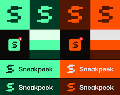
Next, I began working on the initial sketches for the Sneakpeek icon and logo. I explored a few different concepts and eventually narrowed them down to two strong ideas that I felt aligned well with the brand identity. The first was an eye-shaped icon featuring an “S” in the center, representing the concept of "sneak peek" and viewing. The second was a more abstract “S” made out of pixelated blocks, with the top and bottom ends styled to resemble shoelace tips—symbolizing both sneakers and the digital, AR-driven nature of our app.

After further discussions with Michael, we both agreed that the second logo idea—the pixelated “S” with shoelace-inspired ends—was the stronger choice. It looked more visually appealing and felt more relevant to the AR sneaker concept of our project. I then moved on to refine the logo, creating three variations that featured subtle differences in the shoelace areas. After reviewing them, we decided to proceed with the version on the far left, as it best resembled an actual shoelace and added a unique identity to the icon. We also made sure not to round every edge completely, to maintain a bit of sharpness and give the logo a modern, edgy feel.

After finalizing the logo design, I tested its scalability to ensure it would work well across different sizes, especially as an app icon. Thankfully, it turned out just fine—it remained clear, balanced, and visually strong even at smaller sizes. The logo also worked well in both black and white, making it versatile for various uses. Overall, I was happy with what I had produced, as it felt cohesive and relevant to our project.

After setting the typography, it was time to move on to the brand colours. I experimented with a few palettes, and the two that stood out the most were a neon aqua and a vibrant orange. Both colours had strong potential: the neon aqua gave off a sleek, techy, and slightly futuristic vibe—something that aligns with the AR nature of the Sneakpeek app. On the other hand, the orange palette conveyed energy, excitement, and a bold presence, which fits well with the sneaker culture and the hype-driven streetwear scene that Sneakpeek taps into.
After further discussions with Michael, we decided to go with the orange palette. It stood out more visually and better represented the lively and energetic tone we wanted to communicate. In comparison, the greenish neon aqua started to feel a bit too earthy and subdued for the overall spirit of our project.
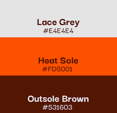
After some brainstorming and gathering ideas from the internet and ChatGPT, I decided to name the brand colours Lace Grey, Heat Sole, and Outsole Brown. All three names are directly related to sneaker terminology, which helps strengthen the branding and maintain relevance to the core concept of the Sneakpeek app. I wanted to avoid using generic or overused names, so I aimed for something more unique and memorable that would resonate with sneaker enthusiasts and give the brand a stronger identity.

After finalizing the visual direction of the brand, I moved on to gathering UI inspiration for the moodboard. I explored Pinterest and a few other design websites, collecting references that aligned with our concept. After going through various styles, I compiled a moodboard that reflects the look and feel we’re aiming for in the Sneakpeek app. This moodboard will serve as our visual guide moving forward in the UI design process.

After that, I searched for an icon pack on Figma and chose Coolicons by Kryston Schwarze because its modern, fun, and clean style perfectly complements our visual direction. The consistent line weights and rounded shapes fit well with Sneakpeek’s friendly and approachable brand identity.

Last but not least, I worked on the mock design, focusing on the main flow and MVP of our app. This included the process from the homepage, to selecting a shoe, and finally having it appear on the user’s feet. Due to the tight deadline, I created a very simple mockup visual. Although I wasn’t fully satisfied with the current mock designs, they serve as a starting point. I definitely plan to improve and refine them during the next stage of the project.
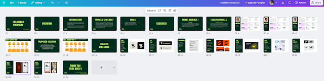
Last but not least, Michael found a slide template that we both customized to our liking. We carefully inserted all our content into the slides, adjusted the layout for clarity and flow, and then recorded our individual video presentations for the proposal. After reviewing everything to ensure it was complete and polished, we finalized the submission and proceeded accordingly.
Reflecting on this project, I realize it has been a valuable learning experience that challenged me in several ways and helped me grow as a designer and collaborator. From the very beginning, choosing the right idea was crucial. Michael and I spent time brainstorming and filtering our options carefully, which taught me the importance of collaboration and gathering feedback—not only from each other but also from peers. Even though we faced some uncertainty about the technical feasibility of the sneaker AR concept, we were able to weigh the risks and ultimately decided to take on the challenge, which was a great exercise in decision-making and confidence-building.
The design process itself pushed me to think deeply about how to visually represent our brand identity. Working on the logo sketches, experimenting with typography, and selecting colors were all creative stages where I had to balance aesthetic appeal with relevance to our project’s core values. It was rewarding to see how the small details—like the shoelace-inspired edges on the logo or the sneaker-related color names—added personality and meaning to our brand. This reinforced the idea that good design is about storytelling and connection, not just visuals.
Working alongside Michael also highlighted the benefits of clear role distribution. Splitting the proposal work based on our strengths allowed us to be more efficient and produce higher-quality content. At the same time, it required good communication to ensure everything fit together seamlessly.
One challenge I faced was time management, especially toward the end when preparing the mock designs. The tight deadline meant I couldn’t fully realize my vision for the app screens, which was frustrating. However, I recognize that iterative improvement is part of the design process, and I’m motivated to refine these mockups further in the next phase of the project.
Overall, this project has deepened my appreciation for the intersection of technology and design, especially in emerging fields like AR. It also reminded me of the importance of user-centered thinking—understanding our audience, their needs, and how we can create meaningful, engaging experiences for them. I’m proud of what we accomplished and look forward to applying these lessons in future projects.


Comments
Post a Comment