Application Design 1 - Final Project
xx.xx.2024 - xx.xx.2024 / Week 8 - Week 14
IAN CHOO XIN ZHE / 0369451
Application Design 1 / Bachelor of Design (Honours) in Creative Media
MIB
In this step, we were required to move from the low-fidelity wireframe stage to the high-fidelity stage. This is where the design becomes colorful and comes to life, transitioning from the grayscale phase to a more polished and visually appealing version.
Once my UI toolkit was ready, I began the next phase of applying the base colors to the pages I had designed. This step was crucial to setting the tone and establishing a cohesive visual style for the app. After applying the base colors, I shifted my focus to the finer details, such as integrating pictures, graphics, and designing buttons to complement the overall aesthetic.
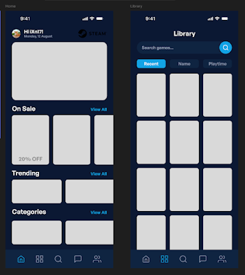
|
| Fig 1.1 Work In Progress |
I started with the game description page, as I considered it the primary feature of the app. Once that was polished, I completed the high-fidelity (hi-fi) design for the purchasing game flow, ensuring that the user experience was seamless and visually engaging.

|
|
|

|
|
|

|
|
|

|
|
|
Working on the high-fidelity stage of the app redesign was incredibly enjoyable and rewarding. It was exciting to see the transformation from a colorless wireframe into a fully developed, realistic app. This step brought my ideas to life, making all the effort worthwhile. However, I do regret not managing my time better during this project. If I had planned my schedule more effectively, I might have been able to include additional features beyond the three main flows, making my app even more robust and comprehensive. This realization has motivated me to focus on improving my time management for future projects to avoid similar regrets.
Overall, this module has been a tiring yet fascinating journey. It challenged me to think creatively, learn new tools like Figma, and embrace a more structured design process. I want to take a moment to express my gratitude to Mr. Zeon for his guidance and dedication throughout this module. His ability to communicate effectively and support students made a significant difference, and I sincerely hope to have the opportunity to work with him again in future courses. This experience has sparked a deeper interest in UI/UX design, and I am eager to continue improving my skills in this field.


Comments
Post a Comment