21.2.2024 - 06.03.2024 / Week 3 - Week 5
IAN CHOO XIN ZHE / 0369451
Information Design / Bachelor of Design (Honours) in Creative Media
Instructable Infographics Poster
After learning about media and information design, I am now creating an infographic that shows different processes using visuals instead of text. My focus is on understanding how the "delivery mechanisms" impact the effectiveness of infographics. While content is crucial, I want to explore what makes an infographic presentation successful or not. This involves considering content as just one part of the infographic. I will be creating two types of infographics: a poster (20% of the project) and a simple animated infographic (20% of the project). The goal is to analyze and showcase what works well in conveying information visually.
I'm tasked with creating an infographic poster for a chosen recipe from Pasta Grannies. I'll focus on studying one video, breaking down the preparation and cooking process, and organizing it into an instructive poster. The aim is not only to convey the steps but also to capture the personality of the Grandma featured and the unique identity of the dish. This approach forms a narrative structure within the poster, allowing viewers to connect with the process on a personal and cultural level. The goal is to make the infographic not just instructional but also reflective of the rich stories and traditions behind each Pasta Grannies recipe.
Fig 1.1 Chosen Video
After reviewing several videos, I've chosen "HOW TO MAKE PERFECT CANNELLONI WITH CARLA TOMASI" as the recipe for my infographic poster. This selection will allow me to break down and visualize the steps involved in making perfect cannelloni under Carla Tomasi's guidance.
The next step involved watching Carla Tomasi's video attentively to comprehend the cannelloni making process thoroughly. During this stage, my focus was on gathering essential data and details to accurately represent each step of the recipe in the infographic. By immersing myself in the video content, I aimed to capture not only the technical aspects of the recipe but also the nuances and insights shared by Carla Tomasi. This data collection phase lays the foundation for creating a comprehensive and informative infographic that effectively communicates the steps involved in making perfect cannelloni.
Cooking Process
Recipe Overview:
Carla Tomasi's cannelloni recipe is a delightful blend of traditional and fresh flavors. The inclusion of marjoram, mint, and lemon zest adds a light and refreshing touch. While the recipe involves three distinct elements, it is described as not difficult. Carla suggests making extra cannelloni, as they freeze well for later use.
Pasta:
For the pasta, a 3-egg mixture requires doubling the egg weight and subtracting 10g for the amount of 00 flour needed. The dough should be smooth, and Carla recommends watching the video for rolling and preparing the pasta.
Filling:
The filling, suitable for cannelloni, ravioli, or lasagna, consists of spinach or a mix with Swiss chard, ricotta (preferably well-drained sheep's milk ricotta), grated parmigiano or pecorino, nutmeg, and fresh marjoram. The ingredients are combined and seasoned, with the filling being freezable for up to three months.
Thin Béchamel Sauce:
The béchamel sauce, a key component, is made with full-fat milk, butter, flour, salt, black pepper, lemon zest, and chopped mint. Carla emphasizes a thin and light consistency. Any leftover béchamel can be frozen.
Assembly and Cooking:
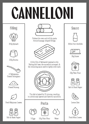
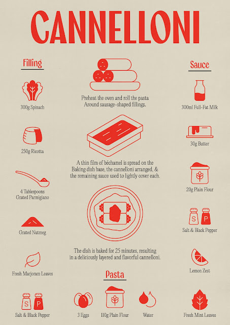
To assemble and cook the cannelloni, preheat the oven and roll the pasta around sausage-shaped fillings. A thin film of béchamel is spread on the baking dish base, the cannelloni arranged, and the remaining sauce used to lightly cover each. The dish is baked for 25 minutes, resulting in a deliciously layered and flavorful cannelloni.
Ingredients
Pasta:
- 3 eggs
- 110g flour
- Water (if needed)
Filling:
- 300g cleaned weight of spinach or a mixture with Swiss chard
- 250g cow's milk ricotta (or well-drained sheep's milk ricotta)
- 3 to 4 tablespoons of grated parmigiano or a mix with grated pecorino
- Grated nutmeg
- Fresh marjoram leaves
- Salt and black pepper
Thin Béchamel Sauce:
- 300ml full-fat milk
- 30g butter
- 20g plain flour
- Salt and black pepper
- Lemon zest
- Fresh mint leaves
Assembly and Cooking:
- Butter for greasing the baking dish
Fig 1.2 Sketches
After familiarizing myself with Carla Tomasi's Perfect Cannelloni recipe and gathering all the necessary ingredients, the next phase of my project took shape during class time. With a pen in hand and a creative mindset, I began sketching out ideas for the infographic design. Throughout this process, I generated five sketches, each exploring different visual arrangements and styles to effectively convey the step-by-step process of creating perfect cannelloni. These sketches served as the initial blueprints, allowing me to experiment with various layouts, color schemes, and graphical elements.
Fig 1.4 Creating Guidelines
Having settled on the sketch that appeared the most organized and user-friendly for my infographic poster, I proceeded to the digitalization phase. Beginning with a rough outline to serve as my guidelines, I moved on to creating the assets themselves. Opting for neat, icon-like representations, I drew inspiration from various icon sites on the web. Using Illustrator and employing the pen and shape tools, I crafted my unique set of icons, adding a personalized touch to the infographic.
Fig 1.6 Completing the Set of Icons
Fig 1.7 Font Selection
For the textual elements, I carefully chose an Italian-friendly font for the title, aligning with the cultural theme of the cannelloni recipe. To maintain readability and a classic aesthetic, I opted for a serif font for the names of ingredients and steps. The use of a serif font adds a touch of sophistication, echoing the traditional and timeless nature of Italian cuisine.
Fig 1.9 Colour Experimentation
With the assets and text in place, the next step was selecting the colors. To make my poster stand out, I decided on a distinctive red and cream color theme. Choosing a 2/3 tone color palette instead of traditional illustration colors aimed to give the poster a unique and modern look, steering away from the typical stock image poster appearance. During the color experimentation phase, I considered an inverted color theme but found the red and cream combination to be more visually appealing and less straining on the eyes.
Fig 1.10 Icon Experimentation
Finally, while experimenting with styles for the icons, I concluded that omitting black outlines enhanced the overall aesthetic, resulting in a cleaner and more cohesive look for the infographic poster. I then applied a texture layer in Photoshop to give my poster some personality rather than just a flat illustration style.
Fig 1.11 Final Submission


Comments
Post a Comment