Advanced Typography - Task 2 - Key Artwork
IAN CHOO XIN ZHE / 0369451
Advanced Typography / Bachelor of Design (Honours) in Creative Media
Task 2
LECTURES
Lecture 5: Perception And Organisation
One important factor that affects how readers receive and comprehend textual material is perception. It includes how people interpret and process typography's visual elements, like layout, letter spacing, and font selection.
- Contrast in Typography

- Size
Size describes an intended variation in font size and other type element dimensions. Within a text, this variety is utilised to establish hierarchy, emphasis, and visual interest. Bigger font sizes are appropriate for headlines and crucial information, whereas smaller font sizes work well for body content and less significant elements. Typographers and designers can improve a composition's visual hierarchy and facilitate readers' comprehension of the text by employing contrast in size. One essential typographic technique that enhances readability and a design's overall effect is size contrast.
Fig 1.2 Size Contrast

- Weight
When we talk about weight contrast, we're talking about the deliberate application of varying thicknesses or boldness levels within typefaces to produce emphasis, hierarchy, and visual appeal. By changing the boldness of text elements, some characters or words will appear heavier and more prominent than others, while other text elements will remain lighter. When it comes to separating headlines from body text, highlighting important ideas, or directing the reader's attention through a composition, contrast in weight can be very useful. It contributes significantly to the creation of a visually appealing and well-balanced typographic design by giving the text depth and contrast.


Typefaces enable designers to establish visual hierarchy and emphasis in their compositions since they frequently have unique styles, weights, and letterforms. These variations can be used by designers to improve readability, draw attention to important details, and provide visual interest.
Fig 1.5 Structure Contrast

- Texture
Texture-wise, contrast in typography refers to how type elements are used to provide a variety of tactile and visual effects in a design. Designers change the text's density, spacing, and placement to accomplish this. Textural contrast can be achieved, for instance, by mixing distinct typefaces with contrasting textures, such as a script font with a sans-serif font, or by changing line spacing (leading) and letter spacing (tracking). The objective is to enhance a typographic composition's tactile and visual aspects with more depth and intrigue. Designers can make their typography more visually engaging and dynamic by enhancing its readability, hierarchy, and overall effect through the smart use of textural contrast.

- Direction
Direction contrast refers to the way that type elements are positioned and aligned within a design. In order to provide eye-catching layouts and distinctive visual interest, this technique plays with changes in text flow, such as horizontal and vertical text or diagonal groupings. It can be used to draw attention to certain words, establish visual hierarchy, or give a composition more movement. Typographers and designers can improve the visual appeal and readability of their work by using contrast in direction, which results in a more visually arresting and captivating typographic design.

- Colour
Colour contrast is a tool used frequently by designers to draw attention to important details, provide visual interest, and direct the reader's eye across a composition. This can entail utilising more muted colours for body text and bold, contrasting colours for highlights or headlines. Colour contrast is an effective technique for improving typographic designs' aesthetic appeal and visual impact while also facilitating reading, communication, and overall appeal.

- Form in Typography
In typography, form describes the way characters and letterforms within a typeface are arranged, shaped, and look. Every typeface has its own forms, which are determined by elements like the individual letter shapes, the thickness of the strokes, the presence or absence of serifs, and the overall design aesthetic.
Form is a factor that typography designers take into account when choosing a typeface for a given project. Through their forms, many typefaces communicate different moods, ideas, and personalities. A sans-serif typeface with thin, consistent lines may imply modernism and simplicity, but a typeface with bold, thick strokes and serifs might reflect tradition and authority.
When choosing a font, line style, and general layout, typography designers also take form into account. The shape of letterforms is an essential component of typographic design since it affects reading and legibility. In printed and digital media, proper form is crucial for effective communication and eye-catching visuals.
- Gestalt Theory
A group of German psychologists created the Gestalt theory around the beginning of the 20th century. It is a psychological framework that focuses on how people see and interpret their environment. The German term "Gestalt" means "form" or "configuration," and the theory it refers to investigates the notion that individuals often view objects and their interactions as ordered wholes as opposed to separate components.
The key principles of the Gestalt theory include:
Law of Similarity: In perception, objects are grouped together based on shared visual properties, such as size, colour, or shape. This idea is essential to comprehending linkages and patterns in the environment.
Law of Proximity: Nearby objects are interpreted as a group or as a single entity. This idea clarifies why individuals arrange information visually.
Law of Closure: To produce a whole and coherent form, people often mentally fill in the blanks or close gaps in incomplete figures. This idea demonstrates how we tend to notice patterns even in the absence of certain details.
Law of Symetry: People find it easier to recognise and understand forms when there is symmetry, as it provides a sense of balance and order. People instinctively put pieces in symmetrical configurations and see them as a single, cohesive whole. Our visual perception relies heavily on the idea of symmetry, which enables us to arrange complex visual data into logical and aesthetically beautiful patterns.

INSTRUCTIONS
TASKS
Task 2A: Key Artwork
In this task, we have been assigned to create and understand what a Key Artwork is. Within the framework of this task, the primary artwork fulfils two functions. It serves as a wordmark or lettering that is mostly applied to personal identification. But it's also regarded as a piece of art in itself, frequently making an appearance as collateral materials on things like T-shirts, lapel pins, and posters. This important piece of art has the intriguing quality of being able to be dissected into separate shapes that, when rearranged, produce colourful patterns. These patterns are essential to maintaining and enhancing the artwork's visual character.
Next, we are required to create a variety of products, such as an animated key artwork, a lapel pin, and a T-shirt. In addition, to set up an Instagram account, which is crucial to turning the main piece of artwork into a brand. We will first concentrate on the animated key artwork and strive to polish the final product there. The ultimate objective is to develop a unified, captivating brand that appeals to the target market.
Process & Progress

A blank canvas or, in my case, a blank mind was where it all started. I started the assignment by using the method of mind mapping for ideation. My intention was to allow my imagination go wild, to catch every idea, no matter how tiny or odd, and to release a flood of ideas. This process provided the foundation for my design journey, as I watched the interconnected web of ideas sprawl across the page.
It was time to focus on the main keywords that would guide the design of my lettermark. Two terms jumped out during the process: "laid back" and "versatile." These were more than just words; they encapsulated the main idea I wanted my lettermark to represent. "Versatile" represented my capacity to adjust to different creative difficulties, while "laid back" summed up my character and way of living.


Over the years, I've come to realise that the creative process is full of surprises. The most profound ideas can occasionally come from the most unlikely sources. I started to accept that creativity is unpredictable and saw each diversion as a chance to find hidden treasures.

I set out to investigate the vast ocean of typography on Pinterest. I saw a potential subject there amid the typefaces and lettermarks: a tech-inspired, gaming-inspired font that had all the right vibes. I suddenly started considering replacing my keywords with "gaming and tech savvy." It seemed to be the ideal fit for the course that my design was taking. This new option matched my interests in technology and gaming.

I was excited about this new path and started to sketch down each idea that came to me. However, as I examined my drawings, I couldn't shake the uneasy feeling I had. My instinct told me that it didn't seem as good as I had imagined, but it just wasn't convincing. It was an unclear and challenging moment at the same time. I was aware that the goal of this creative journey was to push limits and aim for perfection, even if it required starting over from scratch.

And now, when I was delving deeply into my artistic exploration, I then stumbled across another potential idea. Abstract shapes and marks are like a buried treasure trove that I discovered. To be honest, I've always liked abstract shapes a little bit. I've always been fascinated by those unusual, distinctive, and wonderfully weird shapes for some reason. It resembles a puzzle in which each component is extraordinarily flawless.


I started the digitalization process in Adobe Illustrator. Both the gaming/tech-inspired idea and the windmill idea developed in the digital realm. Something interesting happened, even though at first I had thought of "gaming and tech-savvy" as the new keywords for the gaming/tech-inspired concept. I discovered that the keyword "laid back" could be used to describe both designs as I worked on them. Their lowercase lettering exuded an air of casual approachability. It felt as though a common thread connecting all of the designs had been found.
I gave Mr. Vinod a look at my work during the next class to seek for feedback. We had an open discussion about the designs, the keywords, and the messages they represented, taking into account every detail. Eventually, we both came to a conclusion. The windmill idea was clearly the better one because of its unique appeal. It seemed to be the ideal representation of the keywords, signifying versatility, laid-back and freedom. The windmill was undoubtedly the focal point of the display, and I was eager to watch how it would develop further during the next phases of my project.


I made the decision to incorporate off-white and dark grey into the mixture to go with these vibrant colours. Off-white was more in keeping with my personal taste in design, with its delicate and slightly retro feel. It was a tribute to my passion for contemporary retro graphic design, bringing nostalgia into the present day. To keep the colour palette balanced, dark grey was used in place of pure black. Sometimes, stark contrast produced by pure black could strain the eyes after extended viewing. Dark grey produced a pleasing visual experience by adding structure and depth without being overly dramatic.


There are two reasons why the "x" was chosen as the icon. It not only corresponds with my name's initials, but it also takes on the meaning of extraction—a creative process in which the essence is condensed into a distinctive and identifiable mark. The contrast between these two logo iterations illustrates how adaptable my design methodology is. The symbol streamlines the story to ensure easy recognition and memory, while the main logo, with its detailed elements, provides a varied representation of my work.
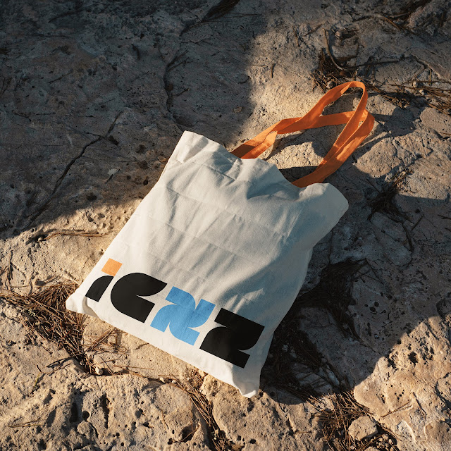
Task 2B: Collaterals
We have been tasked with building a cohesive brand from an animated key artwork, extending its identity over a t-shirt, lapel pin, and an Instagram account, as part of a multidimensional design project. The outcomes are fine-tuned through a refinement and branding process to guarantee alignment with the intended message and mood. The key artwork is transformed from the digital world to phsical mock ups like a t-shirt and and pins, where little areas are imbued with character. And last but not least, an Instagram account is required to showcase the brand.

I used a storyboard to sketch out the animation frame by frame. However, because the first two boxes didn't quite fit the overall idea, I chose to exclude them. They seemed out of place with the rest of the animation. It was similar to editing a story to ensure that every piece matched nicely and made sense together.


When the animation was finished, the next step was to put the logo/key artwork into the real world. I put the logo on a shirt as a test to evaluate how well it functioned in a physical form. After being pleased with the performance of the logo on the shirt, it was time to widen the brand's horizons. As I transitioned from the digital to the physical space, I worked on collateral and mockups. These physical representations would help to increase the brand's visibility.


Incorporating a variety of mockups isn't only for visual variety; it's also a strategic move to integrate the brand into various aspects of life. Each mockup serves as a touchpoint in the overall brand experience. The brand becomes an integrated part of both normal and remarkable occasions, from daily necessities like notebooks to larger-than-life posters and building signage.


Final Outcome
Instagram Profile Link: @icxzdesign


FEEDBACK
Week 4 - Task 2A: Key Artwork
Specific Feedback: Come up with more concepts and ideas, current draft is way too shallow and lacks exploration. Identify keywords and design my lettermark around it & remember less is not more.
Week 5 - Task 2A: Key Artwork
Specific Feedback: Option 1 is better suited to the keywords. However, the letter "i" and "z" look out of place and inbalanced compared to the "c" and "x". Colour scheme is approved and note it in my blog if I explored any other colour palettes. Next, start working on the collaterals and social media.
Week 6 - Task 2B: Collateral
Specific Feedback: Collaterals, mock ups and the logo animation are approved, move on to completing the social media posts. Explore ways to creatively display my brand in instagram posts & complete everything as soon as possible to move on to the final assignment of the module.
Week 7 - Task 2B: Collateral
Specific Feedback: Social media approved, tiles look okay and complete E Portfolio for submission.
REFLECTION
Experience
For me, embarking on this branding journey has been a very pleasurable experience. As someone who enjoys branding initiatives, getting into the process felt like going onto familiar yet exciting territory. However, this time was different, it was a journey of self-discovery as I played both designer and client. The idea evolved into a platform for personal expression and exploration.
Observations
Throughout this journey, it became clear that designing for oneself is a tough task. Navigating the creative process for personal branding was a mixture of enthusiasm and uncertainty. There were times when I felt lost, grappling with the matter of what I actually wanted to say.
The transforming potential of high-quality mockups was one notable observation. These digital canvases considerably improved the designs. The careful search for high-quality mockups proved to be more than simply a visual upgrade; it became a critical step in professionally presenting the brand and developing a lasting impression.
Findings
A significant fact emerged as the pixels settled and the brand identity came together: every design choice is a strong communicator. Each decision, whether it's the choice of a typeface, the creation of a colour palette, or the design of a visual narrative, is significant. Every piece must be carefully picked in order to convey a meaningful and effective message to the audience.
In essence, the journey shed light on the complicated dance of intention and visual representation. Designing for oneself requires not only technical ability but also an in-depth understanding of one's own story and the message they intend to express. As the curtain lowers on this personal design journey, the discoveries serve as pointers for future endeavors, each design decision a brushstroke on the canvas of intentional expression.
FURTHER READING
Investopedia: Brand Identity: What It Is and How To Build One
99 Designs: What is brand identity?
The Branding Journal: The Power of a Strong Brand Identity
Comments
Post a Comment