Advanced Typography - Task 1 - Typographic Systems & Type & Play
27.9.2023 - 20.10.2023 / Week 1 - Week 4
IAN CHOO XIN ZHE / 0369451
Advanced Typography / Bachelor of Design (Honours) in Creative Media
Task 1
LECTURES
Lecture 1: Typographic Systems
Typographic systems are the structured frameworks that govern the selection, arrangement, and presentation of typefaces, fonts, and text elements in various media. There are 8 different typographic systems that exist:
- Axial System
- Radial System
Every element is expanded from a central point.

- Dilatational System
All elements expand in a circular pattern from a central point.

- Random System
There is no discernible pattern or relationship between the elements.

- Grid System
A vertical and horizontal dividing system.

- Transitional System
An informal system of layered banding.

- Modular System
A collection of non-objective items assembled as standardised units.

- Bilateral System
The text is entirely symmetrically placed on a single axis.

Lecture 2: Typographic Composition
Typographic compositions are created by arranging and structuring text elements in a way that is both attractive to the eye and functional.
- Principles of Deisgn Composition
The main design principles for design compositions are emphasis, isolation, repetition, symmetry and asymmetry, alignment and perspective.
Emphasis: The basic idea of emphasis is to draw attention to particular components of a composition. It makes sure that important facts or visual components stand out and deliver the intended message by aiding in drawing the viewer's attention to them.
Isolation: The deliberate separation of specific typographic components from the rest of the composition is referred to as isolation. This can be accomplished by using spacing, contrast, or location to give these items a sense of importance and authority.
Repetition: Repetition occurs when specific typographic components, like fonts, colours, or styles, are used repeatedly throughout the composition. Repetition strengthens the overall design concept and produces a visual unity.
Symmetry and Asymmetry: Symmetry and asymmetry are design approaches that deal with the distribution of visual elements. While asymmetry offers dynamic tension and visual intrigue through purposeful imbalance, symmetry creates a balanced and formal arrangement.
Alignment: Maintaining a clean and well-organized typographic composition requires proper alignment. It guarantees that text and elements are positioned logically and legibly whether using justified, left, centre, or any other alignment.
Perspective: In typography, perspective describes how text and other elements are organised to give the composition depth or a three-dimensional appearance. This method can give typographic designs a sense of realism and spatial dimension.
- Rule of Thirds
The rule of thirds is a composition guideline that places your subject in the left or right third of an image, leaving the other two thirds more open.
Fig 2.1 Rule of Thirds

Why is the grid system the most popular amongst all 8 typographic systems?
The grid system is one of the most widely used typographic systems because it offers design compositions organisation, structure, and visual consistency. Because of their flexibility and perfect alignment, grids can support a variety of content types and platforms while also improving readability and hierarchy. They are crucial for producing aesthetically appealing and practical layouts because they accelerate the design process, encourage efficiency, and add to aesthetic appeal. Additionally, grid systems are a fundamental and enduring tool in typography and graphic design because they have historical significance and easily adapt to responsive design principles.
Fig 2.2 Book About Grid Systems

- Environmental Grid
Environmental grids are grids that take into account and adapt to the particular setting in which a design will be utilised or exhibited. These grids consider the user experience as well as elements like the medium, platform, screen size, and physical or digital context.

- Form and Movement
This system was created to aid students in exploring many possibilities through the use of a variety of forms and the formation of connections among them to produce movement. Designers can ensure visual connection and surprise for the audience by experimenting with form and movement.

Lecture 3: Context & Creativity
The first typefaces were created in order to mimic the look of handwritten letters. Numerous typefaces still today take inspiration from handwritten traditions. Typographers can better understand the fundamentals of letter design, such as proportion, space, and rhythm, by studying handwriting.

- Hieroglyphics
Hieroglyphics are a system of writing that was used in ancient Egypt. They are made up of a mix of alphabetic and logographic characters or symbols. The words, sounds, and concepts in the ancient Egyptian language were represented by these symbols. The history, culture, and religion of ancient Egypt were meticulously recorded using the highly graphic hieroglyphic script.

Over 2,000 years ago, the history of typography began. The Chinese invented moveable type in the eleventh century, but it was Johannes Gutenberg's printing machine that revolutionised typography and made it possible to produce large quantities of books. Following the production of numerous types and fonts, typography emerged as a separate design discipline.

Early Greek: Phoenicians developed a phonetic alphabet consisting of 22 letters. The Greeks then adopted the system and added the necessary vowels. Greek writing was done by hand, without the aid of rules or compasses. Greek writers used a variety of tools, including reed pens and ink, to write on papers like papyrus and parchment.
Roman Uncials: Early Christians adopted the Roman uncial script, which was employed in ancient Rome, for their religious writings. With few cursive characteristics, uncial writing was distinguished by its rounded, upright letters. Broad-edged pens were used to write these characters on surfaces like parchment.
Carolingian Minuscule: Carolingian minuscule is a script that emerged during Charlemagne's rule in the Carolingian Empire during the late 8th and early 9th centuries. It was a clear and standardized writing style that mainly used lowercase letters, incorporated spaces between words, and maintained consistent letter shapes.
Black Letter: In Western Europe between the 12th and the 15th centuries, Black Letter, usually referred to as Gothic writing, was a common script form. It stands out for its elaborate, angular, and closely spaced letters. Black Letter was frequently used in early printed books, legal documents, and manuscripts, especially in Germany.
The Italian Renaissance: Production of books and documents was completely transformed with the invention of movable type and the increase of the printing press. It signalled the shift from manuscript to printed culture and encouraged the creation of new typefaces, typographic guidelines, and design tenets that formed the basis of contemporary typography.
Movable Type: The art of printing with movable type was created in China in the eleventh century and independently developed in Europe in the fourteenth. Small, movable pieces of metal or wood were used to construct individual characters or blocks of writing. These components could be put together by printers to create pages, printed in multiple copies, and then put back together again.
- The Development of Handwriting


One of the oldest and most enigmatic writing systems in the world is the script used by the Indus Valley Civilization (IVC), sometimes referred to as the Harappan script. It was employed by the Indus Valley Civilization, which flourished between 2600 and 1900 BCE in what is now northwest India and Pakistan.

Around the third century BCE, the Brahmi script was developed on the Indian subcontinent and was connected to the legendary Maurya Empire. The script was more adaptable than preceding scripts because it primarily represented sounds phonetically and syllabically. Brahmi developed into a number of regional scripts over time, including Bengali, Tamil, and Devanagari, which are still in use today.

In conclusion, handwriting plays a crucial role in the study of typography since it has an impact on typeface design, helps create aesthetically beautiful and readable fonts, and offers essential historical and cultural insights into the practise of typography.
Lecture 4: Designing Type
- Adrian Frutiger
Renowned Swiss type designer Adrian Frutiger is well-known for his important contributions to typography. The "Frutiger" typeface, which he designed in the late 1960s, is his most well known work. Frutiger is a well liked option for text in print and digital media, navigation systems, and signage because of its praiseworthy clarity, legibility, and adaptability. Readability and consistency were given top priority in Frutiger's design principles, and his font is still a classic illustration of a humanist sans-serif typeface.

- Matthew Carter
The "Verdana" font was designed in 1996 by the highly influential type
designer Matthew Carter. Versatile and sans-serif, Verdana was created
especially to be readable on computer displays. It's a great option for
digital content because of its spacious layout and crisp, contemporary lines.
Verdana is frequently complimented for being readable and clear, especially at
small sizes—a quality that is essential for text on the internet and other
screens.

- Edward Johnston
British calligrapher and designer Edward Johnston is renowned for his innovative work from the early 1900s. The development of the "Johnston Sans" typeface stands out as his most significant typographic effort. It was created as a commission for the London Underground in 1916 and went on to become the system's most recognisable typeface. Designed for use on public signage, Johnston Sans is a typeface that is attractive, clear, and readable. It established a benchmark for reading in public spaces and served as the inspiration for numerous later types. It also lay the groundwork for contemporary wayfinding and informative typography.

- General Process of Type Design
Research: Research involves gathering data and insights about typography. In addition to researching font usage patterns and project requirements, designers can also research the historical development of fonts. The chosen font, the layout, and other typographic components are informed by this study in order to effectively communicate the intended message.
Sketching: Designers can create digital or hand-drawn sketches to provide ideas for visual compositions, font pairings, and layouts. These basic drawings provide the foundation for more intricate typographic design.
Testing: In typography, testing involves evaluating the appearance and functionality of typefaces and typographic features in several settings. This can involve evaluating the typography's overall visual appeal, readability, and legibility. Testing guarantees that the selected designs and typefaces function as intended.
Deployment: The last step in putting typographic designs into action is deployment. It entails incorporating the selected typefaces and layouts into the planned media, be it a printed publication, a website, or another channel of communication. When typography is deployed effectively, the audience is certain to see it as intended.
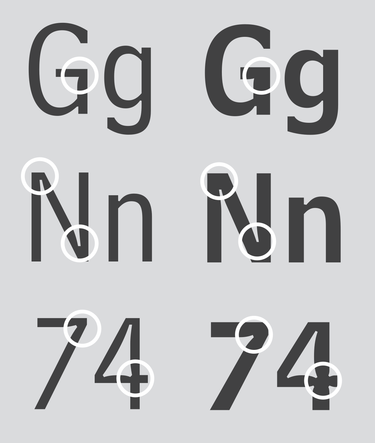
A typographic design element known as a "inktrap" is a little intentional indent or cutaway in a letterform's stroke. These tiny slits or gaps are deliberately positioned at the points where a letterform's two strokes converge, especially at acute angles or curves.
The concept of inktraps has a long history in typography and letterform design. For ages, it has been employed in a variety of scripts and typefaces to overcome the difficulties presented by disparate printing processes. When metal type and letterpress printing were popular, the use of inktraps in type design became commonplace. With the advent of digital typefaces, it has continued to change, guaranteeing that characters in contemporary printing and display settings stay readable and clear.
- Typeface Construction
The process of designing and producing a collection of characters, letters, and symbols with unified and pleasing visual characteristics for typographic applications is known as typeface construction. It's a labor intensive, creative project that blends technological mastery, artistic vision, and typographic expertise. The outcome is a well-designed and adaptable typeface that may be used for a variety of design and communication purposes.

- Construction and Considerations
The categorization of typefaces into different groups based on their visual attributes and design characteristics is known as typeface classification. This system serves as a valuable tool for designers and typographers, aiding them in the identification and choice of typefaces suited to particular design purposes.

INSTRUCTIONS
TASKS
Task 1: Excercise 1 - Typographic Systems
We are required to explore the 8 different typographic systems and produce a design on each system using the copywriting & content provided in the MIB.
- Use Adobe InDesign
- 200 x 200mm dimensions
- Black + other
colours
- Limited graphical elements allowed
Week 1 Attempt

.jpeg)


Task 2: Finding Type (Part 1)
We are required to select a picture for exercise 2 and examine it to look for components that might be turned into alphabets. The image can be man-made, structures or something from nature.
After reading Mr Vinod's article on Finding Type on KREATIF BEATS, I started browsing different image sites for my reference photo.
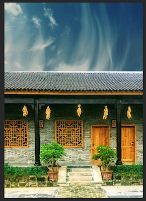
Chosen Image

I found this image from Pexels, a free stock photo library featuring many beautiful images. The thing that caught my eye from this image were the windows and how uniquely designed they were. Upon Mr Vinod's approval I have chosen the windows to be my main subject in finding type.
Identifying & Extracting Letterforms


I did the tracing by using the pen tool in Adobe Illustrator. I realised that I could use the outlines of the windows to trace the alphabets differently. For V1, I was essentially tracing it like how the shape builder tool would work, while for V2 it was simply just about using the outlines to extract the letterforms.

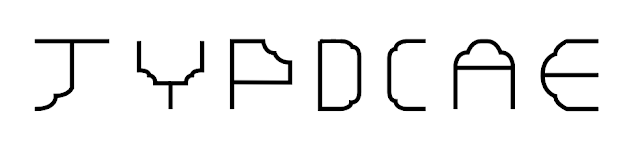

After taking some time to select the final 5 alphabets from the group I managed to identify, I decided to go with H, E, A, D, Y which also makes up the word heady. I chose the 5 alphabets from the 2 different versions that I came up with, so that would be the challenge in standardizing them. The word "heady" is an adjective that can have several related meanings, depending on the context. Some meanings of the word heady are:
- Intoxicating: Refers to something that is powerful, often to the point of being overwhelming, whether used to describe an event, sensation, or substance.
- Euphoric or Exciting: "Heady" can also refer to something that is mentally exhilarating, thrilling, or exciting.
- Lightheaded or Dizzy: Sometimes the word "heady" will refer to a physical experience of being lightheaded or dizzy, frequently brought on by alcoholism or a lack of oxygen.
Reference Typeface

After going through many typefaces on the web and from the ones I've already installed, I decided to select Fivo Sans Modern as my reference typeface due to its uniqueness amongst many San Serifs and the diagonal stroke of the letter "Y" is further apart from the standard "Y" in other San Serifs which ressembles my extracted "Y".
Progress

Next, I simplified certain areas of the design to try to match both versions to create consistency then experimented around by using the pen tool to trace straight off a sketch, resulting in inconsistent weightage and edges in the alphabets.

I then moved onto constructing each alphabet. By doing that, I'm able to achieve consistency throughout all 5 alphabets to tackle my problem from earlier. I used mainly circles with 3 different sizes to construct the letters as my extracted alphabets from my initial extraction featured mant rounded edges. The tool that was used the most for this process was the shape builder tool, in which I was able to use it to combine/remove parts of the alphabet.


On week 4, Mr. Vinod felt that the corner of the E looked thicker and out of place compared to the rest, so I decided to solve that issue by making the edges of the E rounded by using the bowl of my constructed letter D.


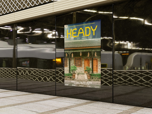
We are required to utilise the refined letterforms from part 1 of the task and create a mock movie poster. The picture that was chosen for the finding type part 1 is to be used for this excercise as the image for the movie poster.


Still, I felt like something was lacking from the poster to make it stand out. After searching for some inspiration on Behance & Pinterest, I decided to add a form of movement to double down on the dramatic effect I wanted to achieve from using the moody preset from earlier. To tackle that, I used the radial blur filter. I then applied a new layer using the Photo Filter adjustment and selected the "Deep Yellow" filter to give the poster a warm & nostalgic look & vibe. And finally, arguably the most satisfying part of a project that involves a poster of some sort, I added in texture layers found from free design element packages found online as the finishing touch of my movie poster.


FEEDBACK
Week 1 - Task 1: Typographic Systems
General Feedback: Go through the brief of Advanced Typography and watch the video on how to set up the Eportfolio on Blogger. Watch Lecture 1 & refer to the brief for task 1: Typographic Systems to understand what to do for it.
Week 2 - Task 1: Typographic Systems
General Feedback: Good when it comes to more organised typographic systems, but other more organic and less organised typographic systems need revision.
Specific Feedback: Dilatational - better composition, try to get movement more connect them
Random - try again more intensity more chaos
Grid - move "The Design School" to the bottom to have more balance
Modular - elements must fit in the grid, they cannot interrupt or go into the other grids occupied by other elements at all
Week 3 - Task 2: Finding Type
General Feedback: Go to Kreatif Beats.com to read up about the Finding Type Article for task 2.
Specific Feedback: Letter E - the tie of it should be shorter & adjust the stroke of it as it has a different thickness compared to the other parts of the E. The rounded part, try consider making it smoother rather than abruptly ending as a straight line
Week 4 - Task 2: Finding Type
Specific Feedback: The corner of the E looked thicker and out of place compared to the rest, poster is approved.
REFLECTION
Experience
It was not the easiest start as I was trying to understand the demands of the subject, with a new environment I was focused on adjusting myself towards it. For Task 1, it was completely new to me and I was interested in learning new skills by using Adobe InDesign & gain knowledge on the topic of Typographic Systems. It felt odd at first using InDesign as it has slightly different mechanics in comparison with my favourite Adobe softwares in Photoshop & Illustrator, but I eventually got there in the end. Moving on to Task 2, it was an interesting task to tackle and certainly got me thinking of it before even finishing task 1. The most challenging part of it was to maintain consistency through out the letterforms & also constructing them from scratch. I enjoyed doing the second part of Task 2 which was the movie poster as I personally enjoy creating posters.
Observations
I noticed that I was overthinking alot of things when it came to doing the tasks, because I can sometimes be a little bit of a perfectionist as I really would like to do well in this subject. For Task 1, I realised that the typographic systems are used all over the world of graphic design and caught myself looking at posters in a different perspective and being able to identify the typographic systems that were used. For Task 2, I noticed that when it came to typography, the smallest of details could make or break a typeface, and that one needs to be obsessed with the tiniest of details in order to come up with a great typeface to be used.
Findings
I was abit skeptical on the typographic systems, however after
executing Task 1, I realised that it was pretty much the foundation of
any design artwork involving typography and that the possibilities of
different layouts were limitless. It aided me in truly undersanding the
bigger picture of typography better. I realised that I appreciated serif
typefaces more , as the details on every single letter was immaculate
and down to every single stroke and edge. I appreciate the more
different or "out of place" typefaces that were being published by
graphic designers as their intention was to have a unique typeface of
their own compared to the famous and standard typefaces nowadays, and it
is certainly not easy to come up with a unique and one of a kind
typeface, especially when it came to constructing it.


Comments
Post a Comment